

 See My Latest Article on HelloNation
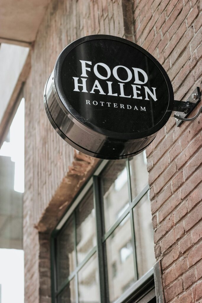
Restaurant signage has two jobs: help people recognize a place and help them understand what to do next. A well-designed sign should be readable from the intended distance, appropriate for the building, and clear in changing light and weather. In Columbia, SC, signs also need to handle strong sunlight, heavy rain, warm temperatures, and seasonal shifts without losing legibility or visual appeal.
What makes a restaurant sign stand out?
A restaurant sign stands out when it has a clear message, strong contrast, and a visual design that can be understood quickly. It does not need to be oversized or complicated. In many cases, a simple sign with well-spaced lettering performs better than one crowded with information.
A useful sign usually has:
- A short, recognizable name or message
- A typeface that can be read at the expected viewing distance
- Strong contrast between the lettering and background
- A clear visual focal point
- Materials and lighting suited to the setting
The sign should communicate its primary purpose within a few seconds. A roadside sign may need to identify the restaurant from moving traffic, while a wall sign near an entrance may focus more on atmosphere and wayfinding.
How large should restaurant lettering be?
Letter size depends on viewing distance, traffic speed, lighting, and the amount of time people have to read the sign. Larger letters are generally needed for signs viewed from streets or parking areas, while smaller lettering may work near a doorway.
A common mistake is designing text based on how it appears on a computer screen. A sign should instead be evaluated at its real-world distance. Thin strokes, decorative lettering, and tightly spaced characters can disappear when viewed from across a lot or through a windshield.
Before finalizing a layout, consider:
- The distance from the sign to the nearest decision point
- Whether people are walking, driving, or waiting in traffic
- The amount of surrounding visual competition
- Whether the sign must be read at night
- The viewing angle from nearby streets or driveways
A short name with generous spacing is usually easier to read than a long name squeezed into a narrow panel.
Which colors improve visibility?
High contrast improves visibility more reliably than bright color alone. Dark lettering on a light background or light lettering on a dark background is often easier to read than combinations with similar brightness.
Color selection should account for both appearance and function. A muted palette can create a refined dining atmosphere, while bold colors may suit a casual or family-oriented setting. However, excessive color can make the sign look busy and reduce recognition.
Useful color principles include:
- Use one dominant background color and one primary lettering color.
- Reserve accent colors for small details.
- Avoid placing similarly bright colors directly beside each other.
- Test colors in daylight, shade, and nighttime lighting.
- Consider how the sign will appear against brick, concrete, glass, landscaping, or painted walls.
Strong sunlight can make some colors appear washed out. Glossy surfaces may also create glare during certain parts of the day, especially when the sign faces an open parking area or a bright roadway.
Should a restaurant sign include the menu?
Usually, the main exterior sign should not contain a full menu. A primary identification sign works best when it presents the name, symbol, or concise message people need to recognize the location.
Menus, specials, operating hours, and service instructions are better placed on separate signs where people have time to stop and read. Combining everything into one panel often creates small lettering and weakens the main message.
A practical signage system may include:
- A primary identification sign
- A directional sign near parking or entrances
- A menu or service information panel
- A temporary sign for seasonal messages
- A window or door sign for hours and basic policies
Using several coordinated signs allows each one to perform a specific task without forcing too much information into a single design.
How can lighting improve visibility without creating glare?
Lighting should make the sign readable, not merely brighter. Even illumination is generally more useful than intense lighting focused on only part of the sign.
Backlighting can create a clean appearance when the lettering or symbol is designed to glow against a darker surface. Front lighting may be more suitable for dimensional letters, textured materials, or signs with detailed graphics. Internally illuminated panels can provide broad visibility but require careful control of brightness and contrast.
Poor lighting can cause several problems:
- Glare for drivers and pedestrians
- Shadows across important letters
- Bright spots that distract from the message
- Reduced contrast between lettering and background
- A sign that appears different during the day and at night
The light source should be considered as part of the original design rather than added after the sign is complete. Brightness, shielding, timer settings, and nearby residential areas may also affect whether a lighting approach is appropriate.
What materials work well in Columbia’s climate?
Restaurant signs in Columbia should be designed for heat, ultraviolet exposure, humidity, rain, and occasional severe weather. The best material depends on the sign’s location, size, mounting method, and desired appearance.
Exterior materials should resist:

- Fading from direct sun
- Moisture entering seams or edges
- Warping caused by temperature changes
- Corrosion around fasteners and mounting hardware
- Dirt buildup that reduces contrast
A durable finish is useful, but maintenance still matters. Rain may wash away some dust while leaving water spots or residue. Pollen, insects, and airborne dirt can collect around raised letters and light fixtures. Simple shapes and accessible surfaces are often easier to keep clean over time.
Signs mounted near trees should also account for falling branches, growing roots that may affect freestanding supports, and landscaping that can gradually block lower portions of the sign.
How should the design fit the building?
A sign should feel connected to the building without disappearing into it. Its proportions, colors, materials, and mounting position should relate to the façade, entrance, windows, and surrounding pedestrian or vehicle paths.
A large sign on a small storefront can feel overwhelming, while a small sign on a broad wall may lack presence. The correct scale depends on the building and the viewing environment, not simply on the available sign area.
Pay attention to:
- The height of the sign in relation to eye level
- The width of the building façade
- Existing architectural lines
- Nearby signs, poles, trees, and utility equipment
- Whether the entrance is easy to identify
- How the sign looks from the primary approach
A sign placed where people naturally look is often more effective than one placed higher or farther away merely because that space is available.
What mistakes make restaurant signs harder to read?
The most common problems are excessive detail, weak contrast, poor spacing, and unclear hierarchy. A design may look attractive up close but fail when viewed quickly from a distance.
Frequent mistakes include:
- Using several decorative typefaces
- Placing text over a detailed photograph or pattern
- Making every word the same size
- Relying on thin lines or delicate lettering
- Including too many menu items or promotional messages
- Ignoring nighttime visibility
- Choosing finishes that reflect direct sunlight
- Placing the sign where trees, vehicles, or seasonal decorations may block it
A useful test is to reduce the design to a quick glance. If the name, entrance direction, or primary message cannot be identified immediately, the layout may need fewer elements or stronger visual contrast.
How can a restaurant sign remain useful over time?
A durable sign should support everyday recognition rather than depend on temporary trends. Distinctive design can come from proportion, color, lettering, texture, or a simple symbol without requiring complicated graphics.
It also helps to separate permanent information from content that changes often. Hours, specials, pricing, and service policies may change more frequently than the restaurant name. Designing these elements as replaceable or separate components can reduce visual clutter and make future updates easier.
Before installation, review the sign in daylight, shade, rain if possible, and nighttime conditions. Check it from the sidewalk, parking area, driveway, and the nearest reasonable viewing point. A sign that remains clear under ordinary local conditions is more useful than one that looks impressive only in a controlled presentation.
BLOG:
<markdown article using ## for section headers and * for bullet points when useful>